Colour in wall art shapes the emotional tone of a room — calming, energising, grounding or uplifting — and helps create harmony between the artwork and the interior design. Understanding colour psychology allows you to choose artworks that make your home feel intentional, expressive and emotionally aligned.
Colour in wall art sets emotion and balance in any room. Use calming, energising or grounding tones to create harmony between your art and interior design.
Colour is the first detail your eyes connect with when you look at a piece of art. Before you notice texture, movement or composition, colour sends an emotional message — telling you whether a room feels calm, invigorating, grounded or uplifting.
As an artist, colour is one of the most intentional tools I use. It guides the emotional tone of a painting and shapes the atmosphere of the space it eventually lives in.
In this guide, we’ll explore how colour psychology influences interior mood, how to choose the right palette for each room, and how colour in wall art brings emotional harmony to your home.
If you’re interested in how colour works in interior environments more broadly, you may also enjoy my article on how colour impacts mood in interior spaces.
Colour influences your nervous system instantly. Before logic or reasoning, your brain reacts emotionally.
Warm tones → stimulate and uplift
Cool tones → calm and restore
Neutral tones → ground and balance
High-contrast tones → add drama and structure
Colour in wall art affects:
While style and technique matter, colour is often the reason artwork feels “right” for your home.
Emotional Tone:
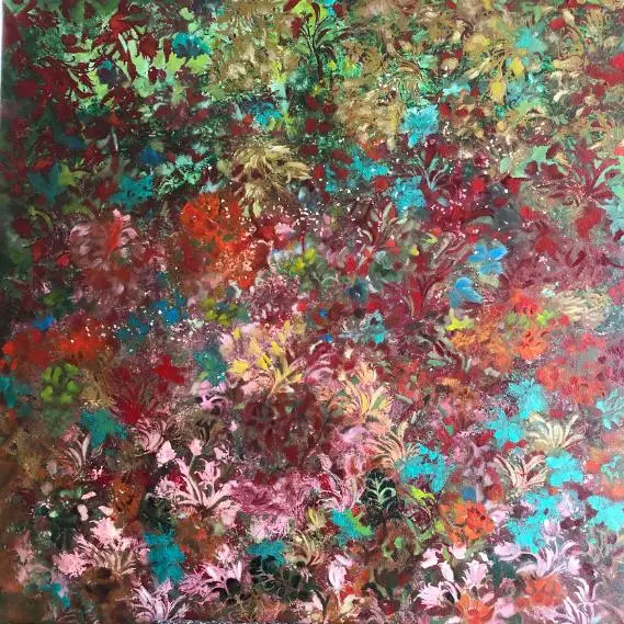
Energetic, lively, joyful, passionate.
Warm colours create movement, conversation and vibrancy — ideal for spaces where people gather or express creativity.
Best Rooms for Warm-Toned Art
If you love expressive movement and warmth, explore pieces in my abstract collection, where bold colours often reflect emotional energy.
Emotional Tone:
Calming, soothing, reflective, peaceful.
Cool tones help quiet the mind and create a sense of ease. They are perfect for spaces where you want rest, focus or emotional grounding.
Best Rooms for Cool-Toned Art
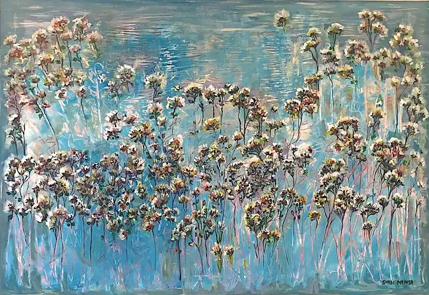
Many works in my nature collection explore greens and blues inspired by forests, water and atmospheric light — perfect for creating a serene environment.
Emotional Tone:
Minimalist, sophisticated, grounding, subtle.
Neutrals create harmony and allow your interior styling to breathe. They blend into almost any space and support both soft and bold design choices.
Best Rooms for Neutral-Toned Art
Neutral palettes also work beautifully with natural textures and brushwork — qualities you’ll find in many pieces across both my abstract and nature categories.
Emotional Tone:
Bold, dramatic, defined, sophisticated.
High-contrast artwork creates intensity and presence. It anchors the room and draws immediate attention.
Best Rooms for High-Contrast Art
This pairs perfectly with the ideas in my guide on statement wall art if you’re creating a bold centrepiece.
Each room in your home has its own emotional purpose. The colours you choose in your wall art can amplify that purpose and set the tone for how the space feels.
The living room is a social and expressive space. Colour here can feel warm, inviting, grounding or energising, depending on the atmosphere you want to create.
Recommended Palettes:
Large wall art with a vibrant palette can unify the room and create a strong visual anchor.
Bedrooms benefit from cool, soft and muted tones that encourage stillness and rest.
Recommended Palettes:
In a bedroom, colour should whisper, not shout. For soft, calming palettes, browse artworks in the floral collection.
Dining spaces feel more inviting when the colours bring depth, warmth and a sense of connection.
Recommended Palettes:
Art in the dining room often acts as a visual anchor, especially if placed on a feature wall or behind the main table.
Hallways benefit from colours that guide the eye and create a sense of movement through the home.
Recommended Palettes:
Avoid extremely high-contrast artwork here unless you want the hallway itself to act as a strong focal point.
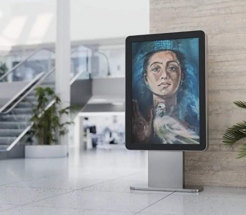
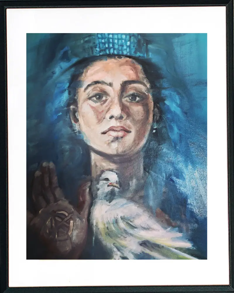
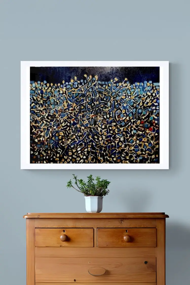
Colour behaves differently depending on whether the artwork is presented as a canvas or framed piece.
Canvas
If you’re choosing between formats, my guide explains this in detail check canvas and framed wall art post.
Framed Art
Framed artwork is especially effective for high-contrast palettes or deeply saturated colours, enhancing their depth and presence.
Harmony in interior design happens when the colours in your artwork connect naturally with the tones already present in the room. This connection can show up in three main ways.
The artwork shares similar tones with the room.
This creates a calm, unified, and seamless look.
Best for:
When everything speaks the same colour language, the room feels peaceful and cohesive.
The artwork introduces a contrasting tone that brings energy and movement into the room.
Example:
A teal artwork in a warm beige living room.
Best for:
Contrast adds personality and creates a focal point without overwhelming the space.
The artwork repeats or amplifies a colour already present in small details around the room.
Example:
A soft pink painting that echoes the shade of your cushions or rug.
Best for:
Accent harmony helps a room feel intentional and thoughtfully styled.
Large artwork often becomes the dominant colour element in a space, making colour psychology even more important.
Large wall art can:
If you’re choosing artwork based on size and placement, see my guide about decorating with large wall art.
Colour preferences shift each year, especially in London-inspired contemporary homes.
For a full breakdown, explore wall art trends for contemporary London homes.
Here are the standout palettes:
Trending Palettes:
These colours feel modern yet timeless, offering versatility for both classic and contemporary interiors.
Your emotional connection to colour matters as much as design theory. Before choosing artwork, ask yourself:
Your personal responses should guide the final decision — colour is as emotional as it is visual.
Colour is one of the most intuitive tools in interior styling. Whether you gravitate toward cool tones that soothe, warm colours that energise, or neutrals that create balance and clarity, let the emotion be your guide.
If you’d like help choosing the right colours — or the right artwork — I’d love to support you.
Contact us now to discuss your space and the colours that will make it feel complete.
It can, but it doesn’t have to. Harmony can come from matching, contrasting or accent colour relationships.
Cool and light tones help visually expand space.
Yes — especially when softened with texture or balanced with neutrals.
Generally yes. Warm tones foster connection, conversation and energy.
Absolutely. A frame can intensify colours, add contrast and change how strong or subtle an artwork appears.